Tuesday, June 15, 2010

PROJECT 3 - ARTIST'S STUDIO/SHOP-HOUSE


This project was particularly challenging, with regards to taking into consideration all the aspects studied in depth in the first exercise. I particularly took a lot of inspiration from the Villa Can Feliz in clearly providing a distinction between the public, private and semi-private spaces.

Precedent Study:


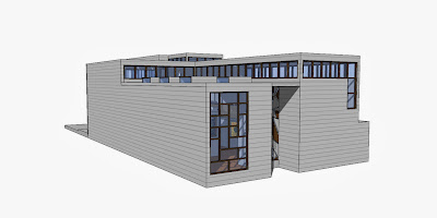
The gallery building is a four-storey structure; the first three storeys functions as exhibition spaces, and the top storey as a residential or gallery space, though the entire building was to have the potential for variable usage. The building incorporates but does not replicate the past. As part of the cityscape, the composition of the four-storey gallery reacts to its immediate context, with regard to building height, and occupies the footprint of the preceding building (destroyed in the war), while at the same time developing a sculptural quality. The façades are composed of brick masonry on reconstituted stone courses and have large window openings reflect the urban scale of the site.

While solid, age-resistant materials characterize the exterior, the interior is defined not by materials, but by daylight and proportion. The building cores organize the space of the 5.5 meter high rooms. All the walls are load-bearing and allow for a simple concrete flat ceiling construction. The simple floor plan varies throughout the four storeys depending on the form of the volume and the placement of the window openings. The gallery spaces are side lit from different directions, and daylight is controlled with interior folding shutters as well as operable outside louvers. The building mass is used for heating and cooling and guarantees a stable climatic condition without further mechanical air conditioning.


I was highly influenced by the simplicity and the clear definition of spaces in this particular example, and also found that the way in which they have utilised the space along with its limitations to its maximum extent was very inspiring.


Narrative:


The art is primarily of recycled nature, or lets just say a new genre of art, which focuses on the points of reuse and reducing the pressure on natural resources in the world. The Gallery owner has a special likening towards this cause, and believes strongly that things are meant to used multiple times, and not wasted as is the trend today. He gives special preference to Artist specialising in this kind of art work, and is the kind of person who would buy all his material primarily out of a junkyard.


His gallery is his home and abode, and represents his cause in every which way, simplistic plain interiors, emphasis on planning and functionality, clear distinction of spaces (private and public), and interactive experience all in all representing the essence of the Art and his immediate surroundings in Newtown.


Site Analysis and Justification;


I chose Site1 because I was particularly interested by the access on both sides, making for a good public and service entrance. However, with a 30M restriction, it proved to be a even better option as I had the use of a large courtyard in the back which could be used as sculpture courtyard, or for parking or just as a recreational space for the owner.


The shadow study enabled me to decide and execute the planning effectively, placing most of the inhabitable spaces where there is maximum access to light, which was one of the core criteria for this design.


Design Development, Ideas and Final Drawings.


The art gallery owner has very specific needs, and wanted distinction in spaces, hence my design here majorly focuses on the circulation and the sequence in which the spaces come about. As one enters the ground floor, they are faced with a wall, and have to walk around to actually be able to enter through the door. The pattern on the front facade causes a bit of intrigue to them encouraging them to come through.


There is also a staggered arrangement of the partitions, slowing down the observer to actually enjoy the space to its best capability and is then led onto the main gallery where there is an interesting play of light on the permanent fixture. Since light was a major aspect that I have considered seriously, there are several ways in which I experimented on how to bring the light in. This abstract form of clear storeys seemed to do justice.


The reason that I have elevated the secondary gallery onto a plinth of 2.5 metres is that, when I build up the room to a height of 4.5 meters, there will still be adequate space for the light to be able to enter the building. I have also recessed it in a little bit to further contribute to the lighting scheme.


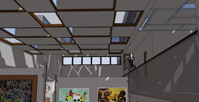
The staircase functions almost as a backbone to the entire building, making it a major element to induce circulation between the building, a transition from public to semi-private to private, from the gallery to the office to the residential area. The artists apartment provides him visual access with the gallery below, but not so much of a physical access.


Model Photographs:


Monday, May 10, 2010

Project 2 - Room and Narrative

About the Artist - Jan Vermeer

Jan Vermeer was born and raised in Delft, which was an active and prosperous Dutch town. This town thrived on its Delftware factories, tapestry weaving ateliers and breweries. There is an indication that Vermeer was higly influenced by the happenings and the domestic life of this town, and also that he hardly ventured out.
His father was an innkeeper and also had a passion for collecting paintings. However his real profession was that of a silk-worker (caffawercker), caffa was a kind of fine satin that was widely used for the clothing, curtains and furniture coverings. It is believed that Vermeer was strongly influenced by this exposure in his childhood, as in most of his paintings rich fabrics and textures played a significant role.
This particular painting was the first of its kind of new kind of paintings he developed, known as genre paintings. These depicted elements of everyday life, and establish a firm relationship between the characters.


A MAID ASLEEP


Interpretation of the Painting
This painting titled 'A Maid Asleep' intrigued me for the mere fact that, it is clearly obvious from the image that the main character in the image isn't quite a 'maid' as the title suggests. My interpretation of the painting enabled me to develop the design. The different components of the painting put together led me to structure it out and represent it as an architectural element.


  1. The lady in the Painting forms the central character for whom I designed my space. She is adorned in rich fabric and jewellery which leads on to believe that she has been gifted all of these. However, there is a look of sadness or dejection on her face, which is very clearly obvious and only shows that what she probably has at that moment is not what she really wants. Thus I came to the conclusion that she is proabably expecting someone's presence and is perhaps lonely, just as a mistress is.
  2. The table cloth in the painting seems to be ruffled as well, which indicates the presence of a second character, who left in a hurry. She is the mistress on this man in question, and he doesn't let her meet other people, hence she waits in her chambers all alone. The architectural interpretation of this led me to design a tower with a chamber for her as it represented confinement to me.
  3. The lighting in the room is very dull, and isn't quite uniform. There is no source of direct natural light in this room. My objective was to design the chamber for this mistress that had plenty of light streaming in, however in a way that she shouldn't be seen but could be able to see outside.
  4. The key in the lock of the door also futher contributed to the confinement idea.
  5. The expression on the ladies face led me to believe that she wasn't in the least bit interested in material objects and all she wanted to do it to be able to have some kind of connection to the real world and the people in it.

In conclusion, the narrative that I have developed is;

A chamber in a tower for a mistress who longs for visual connection with the outside world, by the canal, in Venice, Italy.


SITE AND JUSTIFICATION

The site that I have chosen is along the canal in Venice as I believe that the water will provide a sense of calming to the lady in the image. She will also be connected to the everyday activities of the people visually and be able to see them. Also keeping in mind the social standing of the character in the image, the site has been chosen and placed among other palatial mansions along one side of the canal.

The approixamate location of the site is shown here on the map.


POCHE DRAWINGS

Plan at the Room Level (1:100)


Plan at the Entrance Level (1:100)


Cross section (1:100)


Longitudinal Section (1:100)

Axonometric View (1:100)

MODEL PHOTOGRAPHS


I have depcited the slight curve on the site to show the flow of the canal.


This tower consists of staircases winding its way upto the main chambers, which in a way defines unapproachability. At every landing or break in the staircase, one can get a view of whats happening outside in order to break the montony of the climb.


The fins in the exterior wall provide the lady with a sense of being connected to the outside but not quite. She has a 180 degree view which is broken up by interlacing of solid and void.

I have aligned the fins in a way to bring about more light both from the top as well as front and also this enables the person to feel more connected as it slants outwards.


The sense of the tower has been brought about in order to show that the building is meant for someone kept in confinement.


Tuesday, April 13, 2010

PROJECT 1 – ARTIFICE

VILLA CAN FELIZ, JORN UTZON

Jorn Utzon lived with this wife Lis on the island of Majorca, and their first home there was built in the early 1970’s. However, almost 20 years later, the Utzons decided to build another house, Villa Can Feliz which would serve as the home for their retirement. The decision to build this house was fueled by many reasons as the glare from the sea caused discomfort to Utzon and he wanted a house that was more secure, nestled by the side of the mountain, far away from the pounding surf.

Can Feliz prominently displays Utzon’s love for platform, and it seems to rise out of the site, carved out of the local sandstone which is known as the mares stone. This stone varies in accordance to the Mediterranean sun between the colours Pink and Gold.


The stepped platform is illustrated in this image
which is in a way the highlight of the house.


The living quarters open out onto the swimming pool and
court area by means of stairs, which gives a feeling of descent out into the open.


PARTI REPRESENTATIONS (1:200)

This parti was an attempt to study the GEOMETRY on the spaces in the villa. It is interesting to note that Utzon chose to stick by two generic shapes, i.e. the square and the rectangle and likewise has used that to define the function of the space. He has made use of squares which gives a person the impression of stability and security, whereas the rectangle has been used for corridors and courts which induces curiosity to move forward.


In the CIRCULATION parti, I have highlighted the accessibility from one space to another. All the living spaces are interconnected to each other in the public and semi-public areas, making it very busy. These areas also have access to the direct outside. Whereas in the case of the private quarters, it is less busy and interconnected than the rest of the house.

The STRUCTURE parti shows us that the main skeleton of the villa seems to be one with the site on which it sits. It is quite noticeable how the structure is more solid on the back but opens out in the front, much like the slopes on the site. It in a way explains to us that most of view is out in the front.


The degree of ENCLOSURE is defined by the number of access points to the outer spaces. In my enclosure parti I have highlighted just that, by using bold lines for where there is absolutely no access, thin lines to show that there is only visual access and not physical, and gaps to depict that movement can be brought about through that point.


POCHE RENDERINGS (1:100)


BUILDING MODEL (1:100)


This overall view of the model gives us a brief idea as to the contours with
which we had to work with. The entire villa is structured around these levels
and has varying platforms, all descending down to the open-swimming pool area.


The section cut was made across these contours to depict clearly
the essence of the house, and demarcate the separation between
the public and private spaces.


This view shows how the platforms descend down, and give
the viewer from this point the illusion of the house rising off the ground.


The entrance to the house is towards the back, and is through a
series of colonnades, this leads on to the public spaces i.e. the
living room and study.


The strong geometry that is prevalent throughout the building
is evident in the articulation of the building as well.


A view of the study and the living area.


The windows were framed in such a way that made the light seem to radiate
from the outside as the framework of the windows were on the outside.


The section cut separating the public quarters from the rest.

This view shows clearly the series of steps which lead to the outside from
the semi-private quarters, the kitchen, dining, and living rooms R-L.

These spaces have been classified as semi-private as they are connected to
the outside both visually and literally.

The windows in this phase of the house are characteristic to the purpose
it was defined for, as they are both huge and enhance the view on the outside.
As mentioned before, it is clearly visible that the frames are on the outside.

The roof plane and the ceiling are individual of each other, the ceiling
is vaulted as shown in the figure.


The same vaulted roof is carried out to the open corridor too.


A view of both the semi-private and private quarters.


The private quarters open out into courts too, however there is
no direct access to them unlike the semi-private spaces.